Much like a casual night out, the design process became about moderation. How do we pay homage to the maritime theme without going overboard with it? How do we communicate the quality ingredients without overwhelming the label with photography? And, most importantly, how do we create a product that customers will want to weigh down their own boats with?
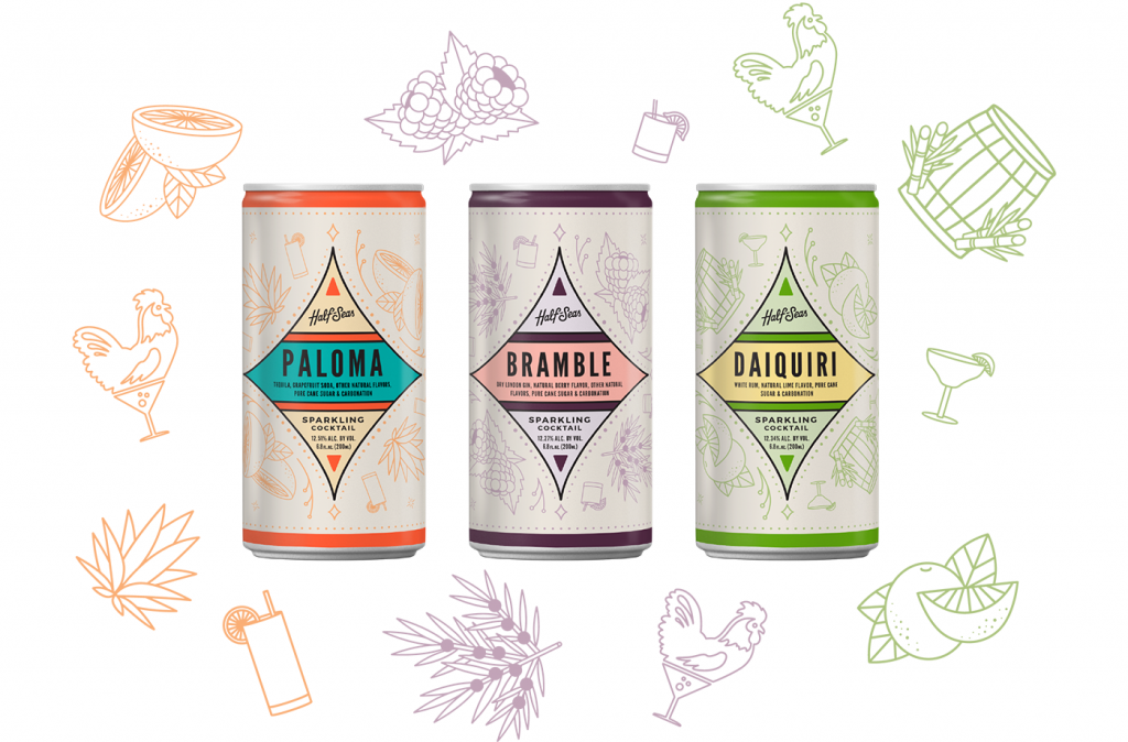
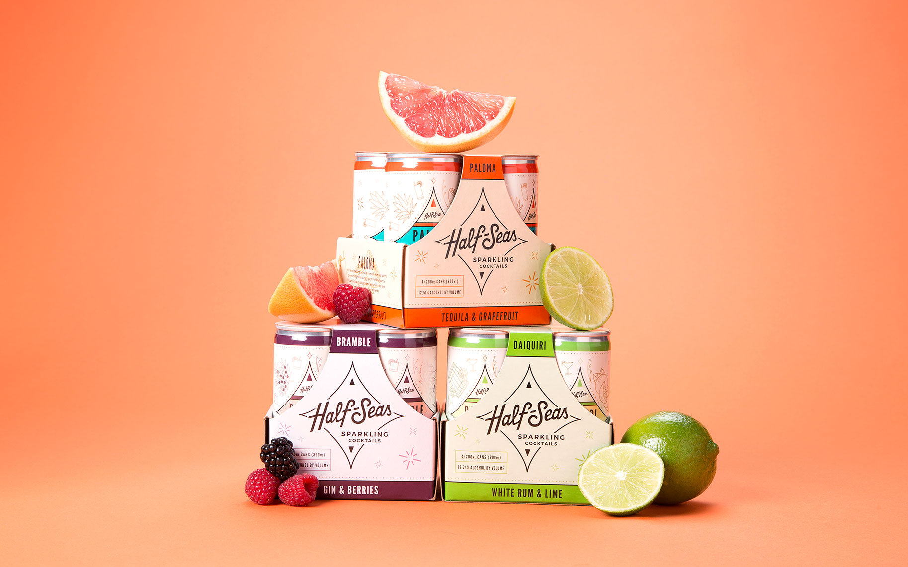
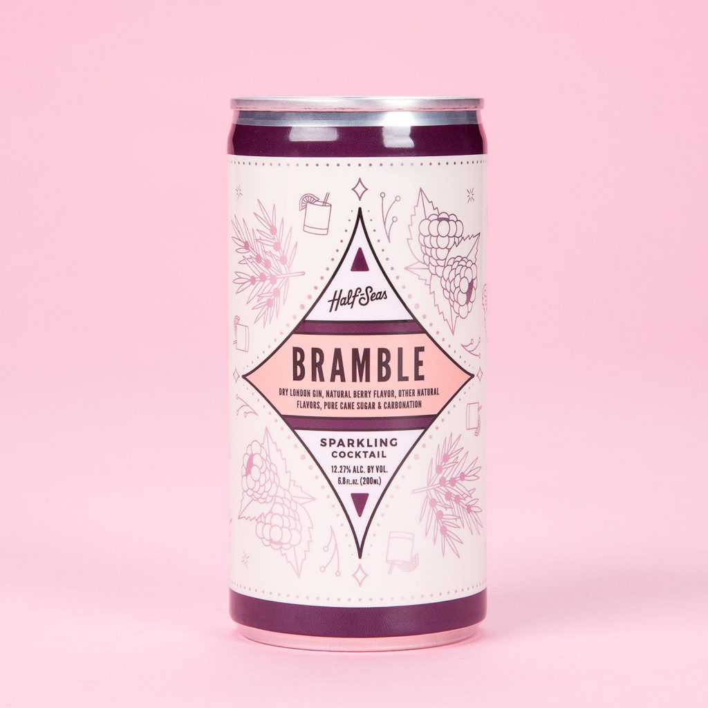
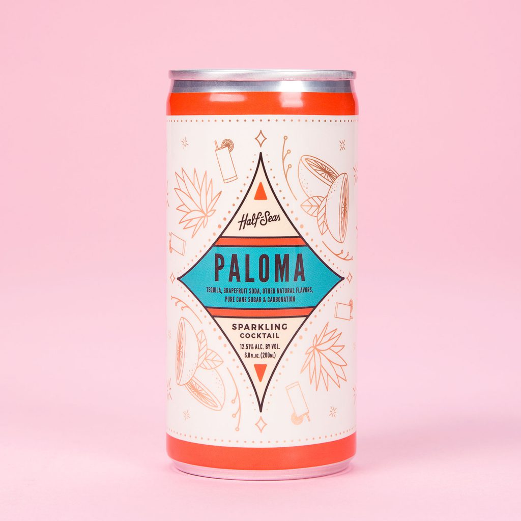
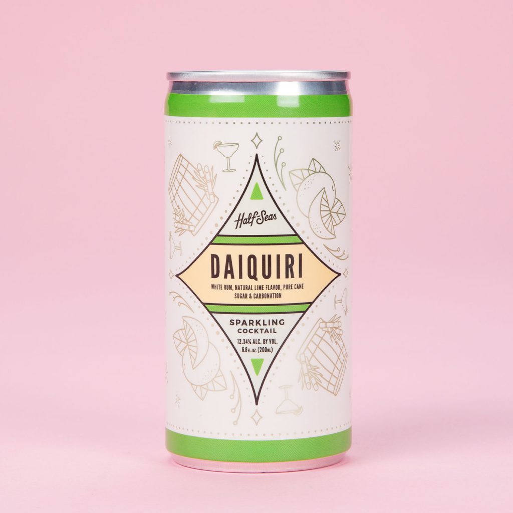
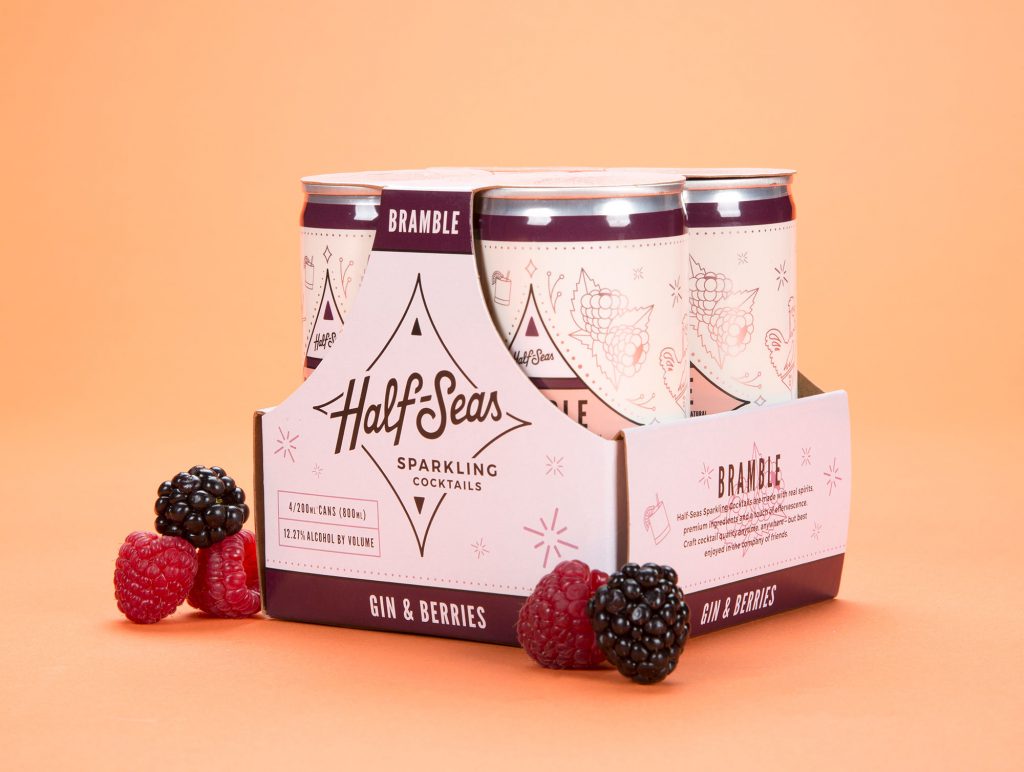
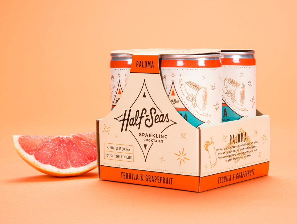
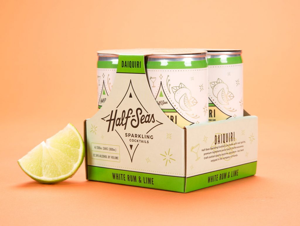
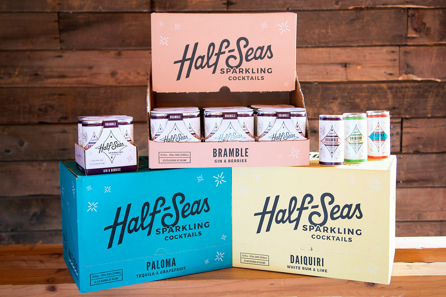
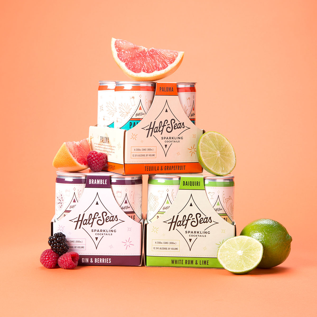
The subtle compass shape became an important ingredient for the branding and packaging, giving a nod to those nautical origins. The logo’s quirky hand-drawn type embodies a tipsy captain navigating through the evening. Brand colors were chosen to capture the intoxicating energy of the beverage while avoiding being overly masculine or feminine. A series of custom icons were created for each can label to playfully communicate the ingredients without being overly literal. They also keep the label uncluttered, allowing these cans to separate from the competition on the shelf.